Hello developers....!
මොකක්ද මේ Silver App Bar එක කියන්නේ ??
Sliver App Bar යනු අනුචලනය කළ හැකි හෝ කඩා වැටිය හැකි යෙදුම් තීරුව ලබා දෙන ෆ්ලටර් හි ද්රව්ය නිර්මාණ විජට් එකකි. Sliver යන වචනය මෙහි අනුචලනය කළ හැකි ප්රදේශවලට ලබා දී ඇත. Sliver යෙදුම් තීරුව මූලික වශයෙන් අපට අනුචලනය කරන විට පෙනුම වෙනස් කිරීමට,අපි දැනටමත් AppBar එක ගැන කතා කරලා අදහසක් අරන් තියෙන්නේ. නමුත්, අප අවට බලන විට අපට පෙනෙන්නේ අනුචලනය කළ හැකි යෙදුම් තීරු පරිශීලක අතුරුමුහුණත බහුලව භාවිතා වන flutter අපට Sliver App Bar විජට් ලබා දෙන අතර එය සාමාන්යයෙන් ළමා විජට් එකක් ලෙස Custom Scroll View (flutter widget) වෙත ගෙන යන අතර එය අන්තර්ක්රියා කිරීමට බලය ලබා දී ඇත. අනුචලනය සමඟ.
Constructor of Sliver App Bar class:
const SliverAppBar(
{Key key,
Widget leading,
bool automaticallyImplyLeading: true,
Widget title,
List actions,
Widget flexibleSpace,
PreferredSizeWidget bottom,
double elevation,
Color shadowColor,
bool forceElevated: false,
Color backgroundColor,
Brightness brightness,
IconThemeData iconTheme,
IconThemeData actionsIconTheme,
TextTheme textTheme,
bool primary: true,
bool centerTitle,
bool excludeHeaderSemantics: false,
double titleSpacing: NavigationToolbar.kMiddleSpacing,
double collapsedHeight,
double expandedHeight,
bool floating false,
bool pinned: false,
bool snap: false,
bool stretch false,
double stretchTriggerOffset: 100.0,
Future onStretchTrigger(),
ShapeBorder shape,
double toolbarHeight: kToolbarHeight,
double leadingWidth}
)
ප්රධාන අoග Silver App Bar:
- action: This property takes in a list of widgets as a parameter to be displayed after the title if the Sliver App Bar is a row.
- actionIconTheme: This property determines the color, opacity, and size of trailing app bar icons.
- automaticallyImplyLeading: This property takes in a boolean as a parameter and controls whether to imply the leading widget if the boolean is null.
- backgroundColor: This property is used to add colors to the background of the Sliver App bar.
- bottom: This property takes in PrefferedSizeWidget as a parameter. And it determines the widget to be shown across the bottom of the Sliver App Bar.
- brightness: This property controls the brightness of the Sliver App Bar.
- centerTitle: This property determines whether the title widget should be in the center of the Sliver App Bar or not. by taking a boolean as a parameter.
- collapsedHeight: This property controls at which height the Sliver App Bar should collapse.
- elevation: This property is used to set the z-coordinate at which to place this app bar relative to its parent.
- excludeHeaderSemantics: This property takes boolean as a parameter and controls whether the title widget should be wrapped in header Semantics which describe the widgets uses in the app.
- expandedHeight: Like the collapsedHeight property it also takes a double as a parameter and determines the height at which the SliverAppBar should be fully expanded.
- flexibleSpace: This property takes in widget as a parameter and stacks it behind the tool bar when it collapses.
- floating: This property takes in boolean as a parameter and controls the animation related to the visibility of the SliverAppBar. It determines whether the SliverAppBar should be made visible as soon as the user scrolls towards it (top or bottom) or not.
- forceElevated: This property controls whether to show shadow for the elevation or not if the content is not scrolled under SliverAppBar.
- iconTheme: This property is similar to the actionIconTheme. It controls the color, size, opacity, etc of the icon used in the SliverAppBar.
- leading: This property sets the widget that should be displayed before the title.
- leadingWidth: This property takes double as a parameter and controls the width of the leading widget.
- onStretchTrigger: This property takes in AsyncCallback as a parameter, which gets triggered when the user over-scrolls.
- pinned; This property sets whether the SliverAppBar should remain visible at the start of scroll view. It takes a boolean as a parameter.
- primary: This property takes boolean as a parameter and controls whether the SliverAppBar is being displayed at the top of the screen or not.
- shadowColor: This property determines the color of the shadow which gets displayed below SliverAppBar.
- shape: This property is used to give shape to the SliverAppbar and manage its shadow.
- snap: This property takes boolean as a parameter and if set true it makes the SliverAppBar snap in the view when a user scrolls near it instead of smoothly animated. There is one constrain to snap property that it can only be set to true when floating is also set to true.
- stretch: Again, this property also takes a boolean as a parameter to determine whether the SliverAppBar should stretch to the full space of the over-scroll area.
- stretchTriggerOffset: This property determines the offset of over-scroll which activates onStretch property.
- textTheme: This property takes TextTheme widget as a parameter to determine the typography style used in the SliverAppBar.
- title: This property usually takes in the main widget as a parameter to be displayed in the SliverAppBar.
- titleSpacing: This property determines the amount of spacing around the title widget in a horizontal fashion.
- toolbarHeight: This property controls the height given to the toolbar portion of the SliverAppBar.
උදාහරණ ක්රියාකාරකම:
src/lib/main.dart
import 'package:flutter/material.dart';

void main() => runApp(MyApp());

class MyApp extends StatelessWidget {
 @override

  Widget build(BuildContext context) {

    final title = 'Apps Lanka Dev';
     return MaterialApp(
      home: Scaffold(
        body: CustomScrollView(

            slivers: [

              SliverAppBar(

                snap: false,

                pinned: false,

                floating: false,

                flexibleSpace: FlexibleSpaceBar(

                    centerTitle: true,

                    title: Text("$title",

                        style: TextStyle(

                          color: Colors.white,

                          fontSize: 20.0,

                          fontWeight: FontWeight.bold,

                        ) ,//TextStyle

                    ), //Text

                    background: Image.asset(

                     'images.jpg',

                      fit: BoxFit.cover,

                    ) //Images.network

                ), //FlexibleSpaceBar

                expandedHeight: 230,

                backgroundColor: Colors.greenAccent[400],

                leading: IconButton(

                  icon: Icon(Icons.menu),

                  tooltip: 'Menu',

                  onPressed: () {},

                ), //IconButton

                actions: [

                  IconButton(

                    icon: Icon(Icons.comment),

                    tooltip: 'Comment Icon',

                    onPressed: () {},

                  ), //IconButton

                  IconButton(

                    icon: Icon(Icons.settings),

                    tooltip: 'Setting Icon',

                    onPressed: () {},

                  ), //IconButton

                ], //[]

              ), //SliverAppBar

              SliverList(

                delegate: SliverChildBuilderDelegate(

                      (context, index) => ListTile(

                    tileColor: (index % 2 == 0) ? Colors.white : Colors.green[50],

                    title: Center(

                      child: Text('$index',

                          style: TextStyle(

                              fontWeight: FontWeight.normal,

                              fontSize: 50,

                              color: Colors.greenAccent[400]) //TextStyle

                      ), //Text

                    ), //Center

                  ), //ListTile

                  childCount: 51,

                ), //SliverChildBuildDelegate

              ) //SliverList

            ], //[]

          ) //CustonScrollView

      ), //Scaffold

      debugShowCheckedModeBanner:false,

      // Remove debug banner for proper

      // view of setting icon

    ); //MaterialApp

  }

}
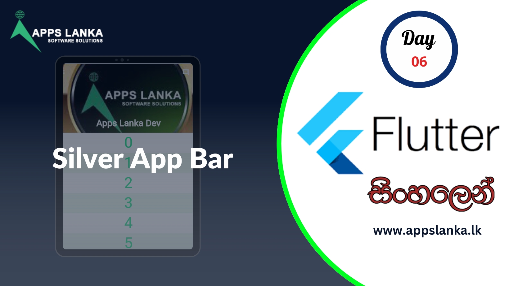
Before Scroll Down

After Scroll Down will hide the App Bar

We are developing Mobile application and Web application for more details visit our web site www.appslanka.lk
0 Comments