This template was created using the most recent technologies, including HTML5, CSS3, and Bootstrap 5. All available browsers and devices are compatible with this template, which is fully responsive. The clean code in this template can help you with your project.
How to create a simple BOOTSTRAP 5 Job Template?
1. Create a new index.html file in your project root. Include the tag as well for proper responsive behavior in mobile devices.
<!DOCTYPE html>
<html lang="en">
<head>
    <meta charset="UTF-8">
    <meta http-equiv="X-UA-Compatible" content="IE=edge">
    <meta name="viewport" content="width=device-width, initial-scale=1.0">
    <title>Job Template</title>
</head>
<body>
</body>
</html>
2. Include Bootstrap’s CSS and JS. Place the <link> tag in the <head> for our CSS, and the <script> tag for our JavaScript bundle (including Popper for positioning dropdowns, poppers, and tooltips) before the closing </body>. Add Font Awesome CDN to your website
</head>
<link rel="stylesheet" href="https://cdn.jsdelivr.net/npm/bootstrap@5.0.0-alpha1/dist/css/bootstrap.min.css">

<link rel="stylesheet" href="https://cdnjs.cloudflare.com/ajax/libs/font-awesome/4.7.0/css/font-awesome.min.css">

 <script src="https://cdn.jsdelivr.net/npm/bootstrap@5.0.0-alpha1/dist/js/bootstrap.bundle.min.js"></script>
</head>
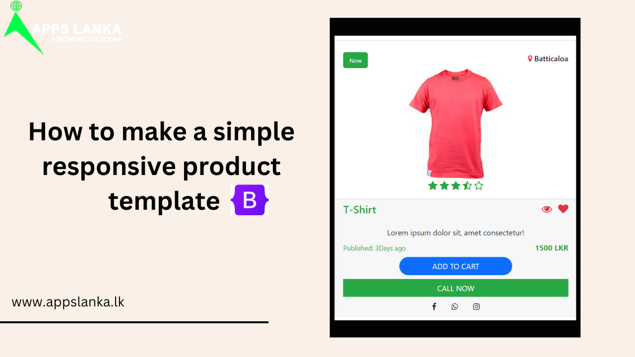
3. Finally add your simple code.
<div class="container mt-3">
<div class="row">
<div class="col-md-3 my-4">
<div class="card pt-2" >
<div class="card-body">
<div class="d-flex align-items-center">
<div class="btn btn-success" style="font-size:small; border-radius:5px;">New</div>
<div class="ml-auto"><h6><i class="fa fa-map-marker text-danger fa-1x" aria-hidden="true"></i> Batticaloa</h6></div>
</div>
<div class="text-center"><img src="" width="200"></div>
<div class="d-flex align-items-center">
</div>
<div class="text-center ml-auto"><i class="fa fa-star text-success fa-lg" aria-hidden="true"></i> <i class="fa fa-star text-success fa-lg" aria-hidden="true"></i> <i class="fa fa-star text-success fa-lg" aria-hidden="true"></i> <i class="fa fa-star-half-o text-success fa-lg" aria-hidden="true"></i> <i class="fa fa-star-o text-success fa-lg" aria-hidden="true"></i></div>
</div>
<div class="card-footer">
<div class="d-flex ">
<div class="card-title text-success"><h4>T-Shirt</h4></div>
<div class="ml-auto text-danger"><i class="fa fa-eye fa-lg" aria-hidden="true"></i></div>
<div class=" text-danger "><i class="fa fa-heart fa-lg" aria-hidden="true"></i></div>
</div>
<div class="text-center mt-2">Lorem ipsum dolor sit, amet consectetur!</div>
<div class="d-flex ">
<div class="text-center mt-2 text-success"><small>Published: 3Days ago</small></div>
<div class="text-center mt-2 text-success ml-auto"><b>1500 LKR</b></div>
</div>
<div class="cart-button text-center mt-2"><button class="btn btn-primary text-uppercase w-50 " style="border-radius:20px">Add to cart</button> </div>
<div class="cart-button text-center mt-2"><button class="btn btn-success text-uppercase w-100 " style="border-radius:0px">Call Now</button> </div>
<div class="d-flex justify-content-center">
<div class="text-center mt-2 mx-3 "><i class="fa fa-facebook" aria-hidden="true"></i></div>
<div class="text-center mt-2 mx-3"><i class="fa fa-whatsapp" aria-hidden="true"></i></div>
<div class="text-center mt-2 mx-3"><i class="fa fa-instagram" aria-hidden="true"></i></div>
</div>
</div>
</div></div>
</div>
</div>
I hope this is useful.
0 Comments